So you’re you’ve bought your camera gear, your tripod, your filters, your step ladder; you’ve found the perfect beauty spot and you know when the light is best. All that’s left now is the most important aspect of photography, which is to compose your image so that you produce a well balanced, striking picture.
Sometimes the “shot” leaps out at the photographer the moment he sees the subject, but usually you will need to apply some compositional techniques in order to make sense of the landscape in front of you. By this I mean that you will be able to focus in on what makes the landscape beautiful or unique – what is the most striking feature of the landscape.
It is often said that the first rule of photography is that there are no rules and how true this is. The world we live in so varied that it would be impossible to apply rules to the way we view it (either as photographer or viewer). There are infinite ways of looking at any subject and no right or wrong way – the most important thing is that the photographer has studied his subject and taken a conscious decision as to how he wants to compose the image. A great photo is rarely taken at random – the photographer might get lucky when a lion makes a kill right in the middle of his African panorama, but blithely pressing the shutter at random will rarely produce anything half decent.
Anyway, so what compositional techniques can we apply? Read on.
The Rule of Thirds
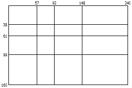
I use the word rule loosely as this is a technique not an obligation. The rule of thirds is probably the best-known technique in landscape photography. It’s also the easiest to apply. If you divide your image into a grid of 3 rows by 3 columns, simply place dividing lines (sea/sky etc) along these lines to produce a more balanced, harmonious picture. The points where vertical and horizontal lines cross have particular “power” as it were and placing important objects along these points will also enhance an image’s composition. Apparently Westerners view images like they read (i.e. left to right), Asians would tend to view images from top to bottom and Arabic readers from right to left
The Divine Proportion.
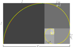
This is basically a more sophisticated rule of thirds. If you have read Dan Brown (and I haven’t) you’ll now all about an Italian mathematician called Fibonacci and his series of numbers. Fibonacci discovered a ratio, known as the golden ration, the divine ratio and a host of other names, which seem to occur in a staggering range of instances in the natural world. The proportions of our faces, limbs, butterflies’ wings, and seashells are all determined by this ratio (the scientific name for the number is phi).
The ratio is approximately 1:0.618 and can be used for an almost endless variety of purposes – even to predict movements in the financial markets (I wonder if Lehman Bros knew about phi?). Luckily for the humble landscape photographer we can also use phi to aid the composition of our photographs.
You can produce a grid of lines using phi, in much the same way as one does for the rule of thirds and placing divisions and objects along these lines will improve the balance and harmony of our photographs.

If you really want to be a smarty-pants, you can use a Fibonacci spiral to aid your composition:

Or you can use a series of triangles, all conforming to the golden ratio. There is a very good software available called Phimatrix which allows you to superimpose phi grids etc onto images to aid in the cropping of images in Photoshop. Otherwise a piece of acetate with a golden grid drawn on it will help when out in the field.
Using Lines
A line represents a "path" between two points and can be straight, curved, vertical, horizontal, diagonal, or zigzag. Lines can give a sense of motion and suggest direction or orientation. Sometimes placing four dots on a page in the shape of a square can imply the points are linked, as your mind will search for recognizable patterns.
The direction and orientation of lines also imply certain feelings. Horizontal lines imply tranquillity, whereas vertical lines imply power and strength. Oblique lines imply movement or action. Curved lines or S shaped lines imply quiet, calm and sensual feelings. Lines that converge give a sense of depth, scale and distance - a fence or roadway converges into the distance provides the illusion that a flat two-dimensional image has three-dimensional depth. A line is an effective element of composition because it can lead the viewer's eye. Look at how lines flow through your intended image – it’s often a good idea to have roads or rivers appearing out of the corner of the image.
Using Colour
Colour as a compositional technique is a huge subject - colours close to each other on the spectrum (yellow and green) are harmonious and colours opposite on a spectrum (green and violet) provide good contrast. Colours can be warm or cold, signify danger, sex, safety, the possibilities are endless but look for colour patterns and contrast in your photographs. You can also use black and white (light and dark) to great effect.
Dominance and Subordination:
This is nothing to do with whips and chains but is where the photographer attempts to control the sequence in which visual events in the frame are observed and the amount of attention each element receives. You can make an element dominant through size and colour. Large objects dominate smaller ones and warm coloured objects dominate cooler pale coloured objects.
You can also place the dominant object in or near the centre of the image. Another method to achieve dominance is through convergence or radiation or lines. The eye will tend to follow these lines to the point where they converge. For example the veins of a leaf converging to the stem.
Dominance can also be achieved through nonconformity and if all the elements are similar and one is different in colour, tone or shape it will stand out and become dominant.
Coherence
Coherence is where an image is made up of similar shapes, colours and textures - for example pebbles on a beach. This can be quite soothing on the eye, but at the risk of being boring so use carefully!
Balance and Rhythm.
Viewers will tend to interpret the centre of an image as if it were a fulcrum – if you put a large object on one side, a smaller object will need to be far away for the image to appear balanced (think of how you would balance different weights on a scale). If you a shooting a beach, having a rock in one corner of the foreground can therefore add depth and balance to the cliffs in the distance. Rhythm is a series of repeating patterns like fence posts and can give an image depth and interest, drawing the eye along the pattern.
Borders
Use elements of the image to frame or part frame your photograph, a line of rocks along the bottom of an image of ate coast adds stability, maybe that Norman spire would look nice framed by the leaves and branches of the oak tree you’re standing next to. A good border complements and enhances the main subject of the photograph.
Conclusion
As you can see there are a whole host of techniques you can apply to landscape photography – which ones work on different occasions will depend on what you are shooting. The most important thing is to look at the subject, and try to make sense of it – look at the colours, shapes patterns. How can you make different elements of the image contrast or complement each other, are there identifiable patterns, where is that river going, what can I add to the foreground to give more depth, etc., etc., etc. A famous photographer once said you should close your eyes for ten minutes and then take another look – that’s probably not a bad way to end this article!
Please feel free to publish this article on the web, but only if you maintain the links to my website and give me full credit for authorship


